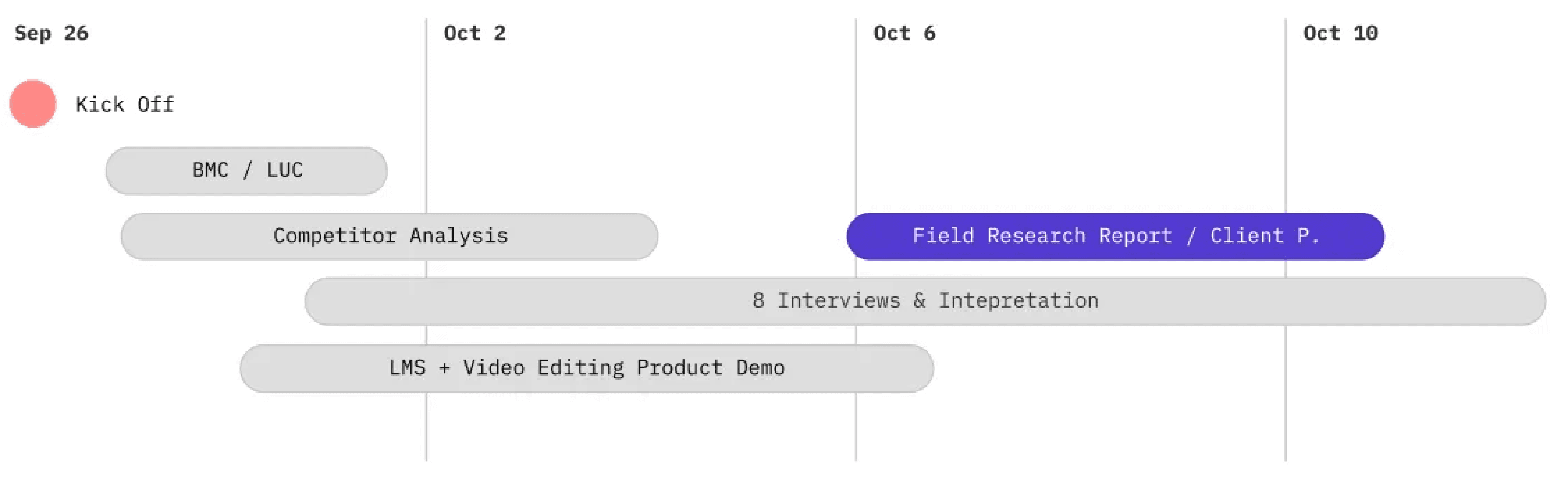
KICKING OFF SPRINT 2
KEY ACTIVITIES
MAP
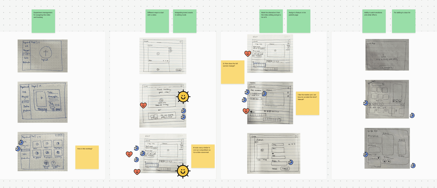
After walking our client through the Journey Map and our organized How Might We notes, the client shortlisted three statements that will be considered key focus areas moving forward.
SKETCH & DECIDE
SHORTLISTED HMW STATEMENTS

Top priority
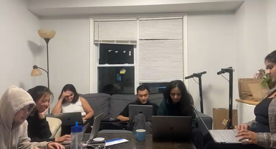
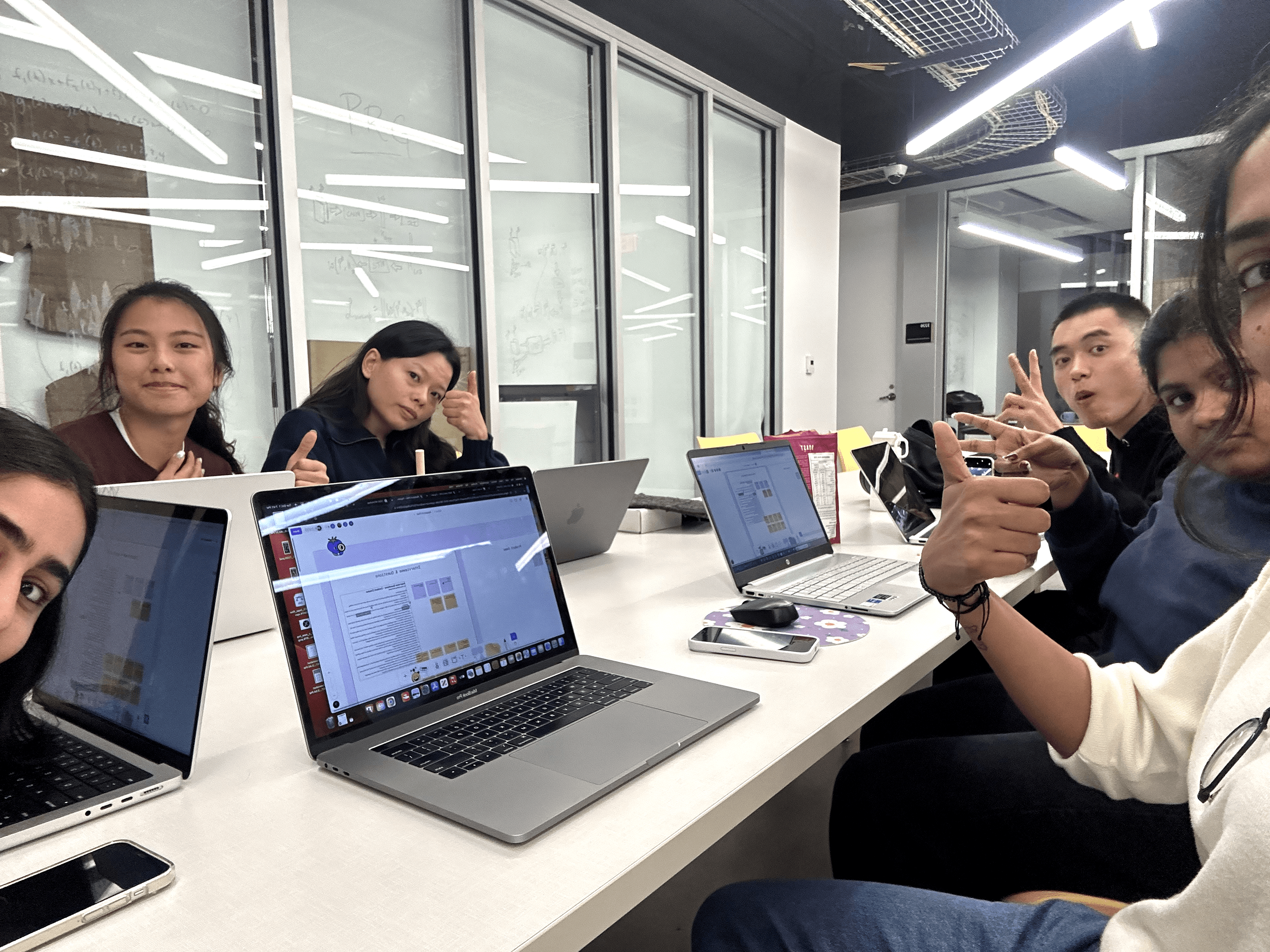
We present our sketches and ideas to the client, and after two rounds of voting, here are the ideas that received a ‘Super Vote’ These are ideas the client loved and wanted us to incorporate them in wireframes.
After walking our client through the Journey Map and our organized How Might We notes, the client shortlisted three statements that will be considered key focus areas moving forward.
SHORTLISTED HMW STATEMENTS
Top priority
We present our sketches and ideas to the client, and after two rounds of voting, here are the ideas that received a ‘Super Vote’ These are ideas the client loved and wanted us to incorporate them in wireframes.


SKETCH & DECIDE
MAP
KEY ACTIVITIES
KICKING OFF SPRINT 2
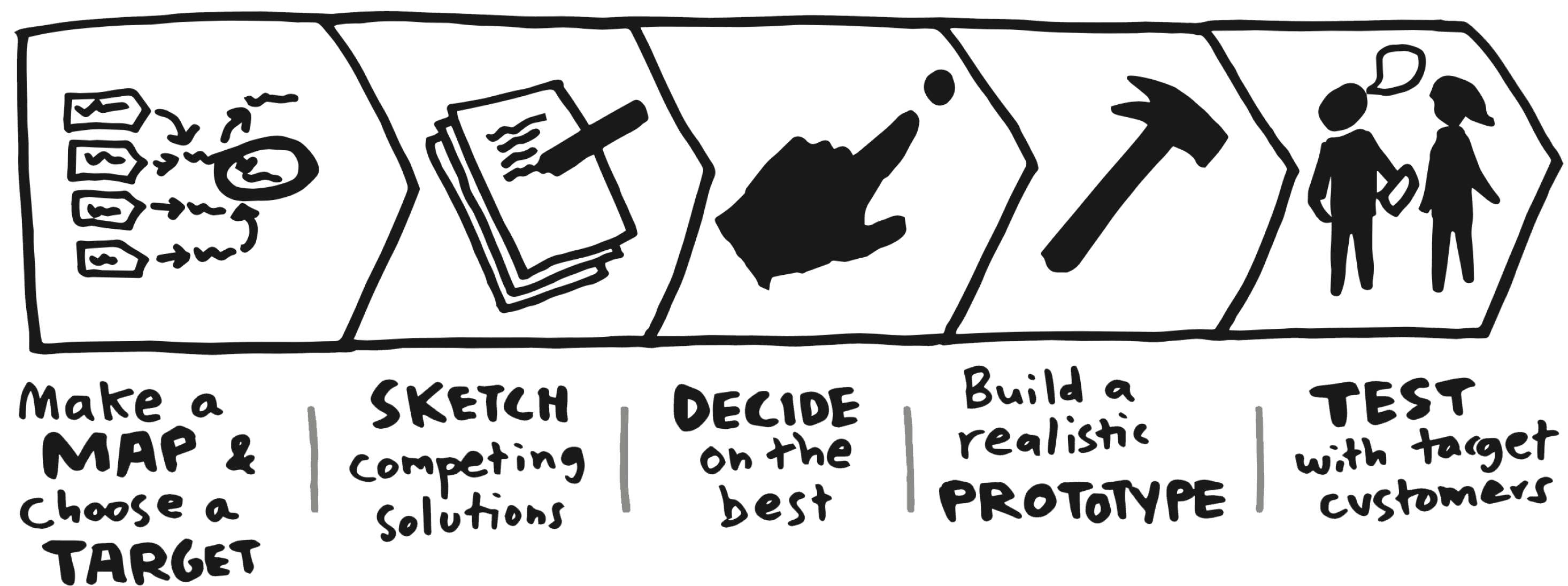
To set the foundation for Sprint 2, we began with a focused brainstorming session to define the key questions we wanted answered by the end of this sprint.
This exercise helped ensure our efforts were guided by clear objectives
We adhered to the Sprint Methodology—a structured, iterative process commonly used in industry—to guide our work. This decision allowed us to test its efficiency and learn how to refine our day-to-day design methods.
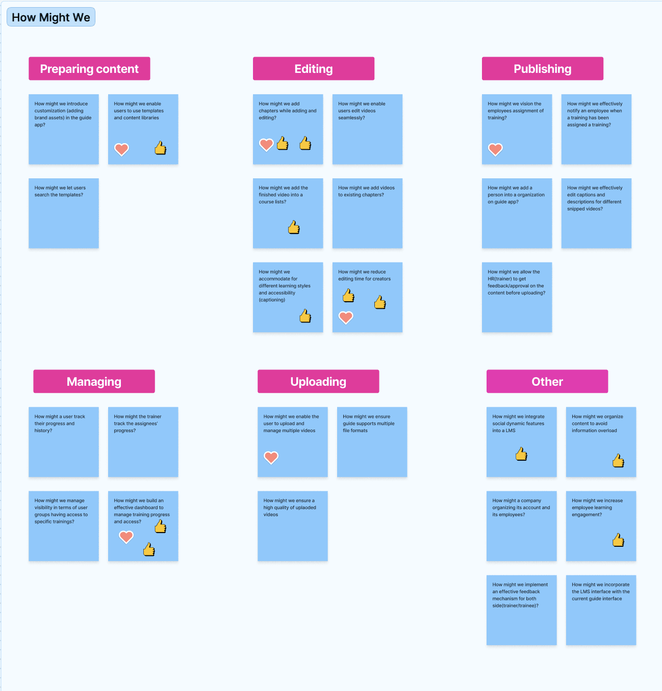
We started by creating a storyboard of how a user might engage with the Guide App, focusing particularly on the "Mark & Snip" function. This helped us visualize a persona and the user journey in context. Next, we conducted the "How Might We" (HMW) exercise to generate problem statements and prioritize areas of focus through dot voting.
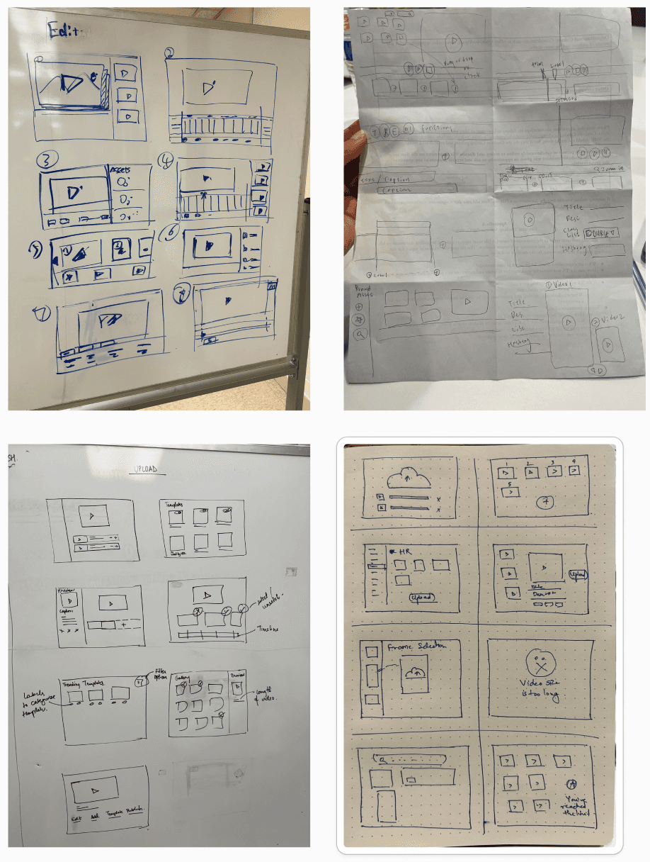
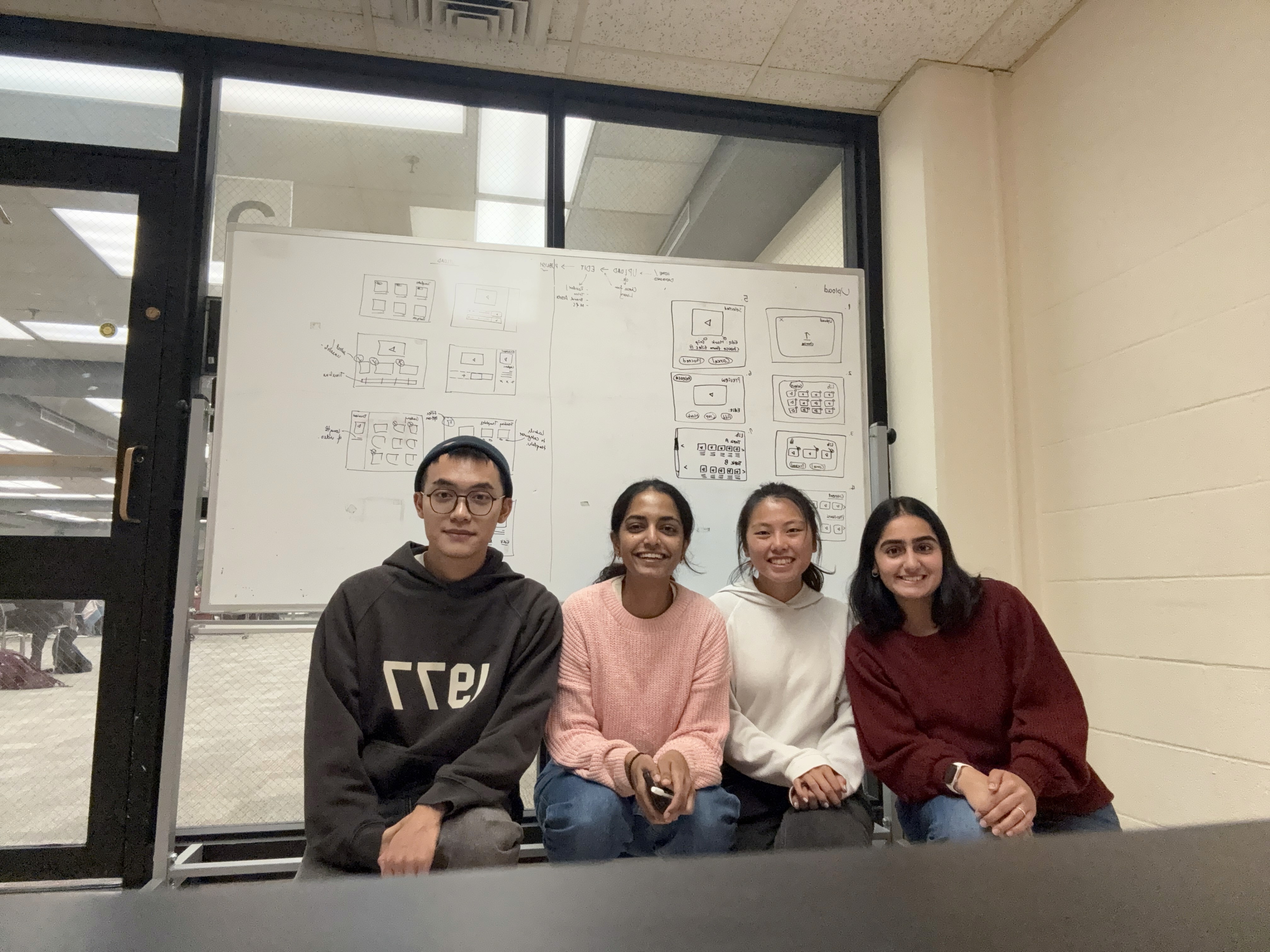
Armed with our HMW insights, we explored potential solutions through individual brainstorming and Crazy 8s. Each team member sketched ideas for the upload and edit stages, which were then consolidated in an art wall format. After a round of team voting, we identified key concepts with the most promise.
This activity gave us clarity on our client’s goals and helped us narrow down on our solution sketches.
What are the most user-friendly methods for uploading files to our platform? Are there steps or processes that could be simplified or automated?
Where do users most frequently need to access the "Mark & Snip" function within the app? Should it be a standalone tool or integrated into specific workflows?
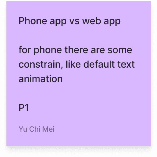
What are the primary challenges users encounter with the Guide app? Are there usability issues, technical limitations, or content gaps?
How can we improve the overall video editing experience? Are there any performance or usability pain points?
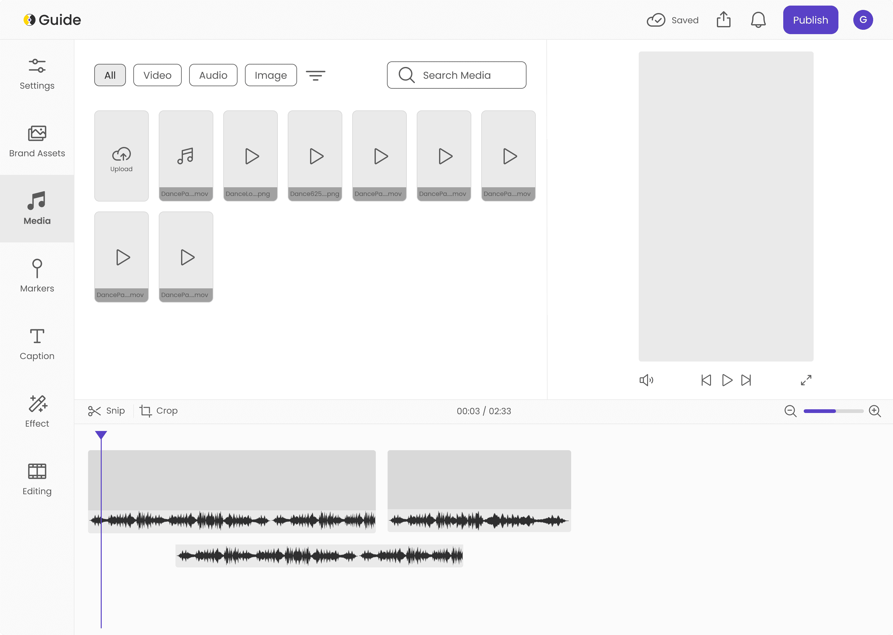
WIREFRAMING
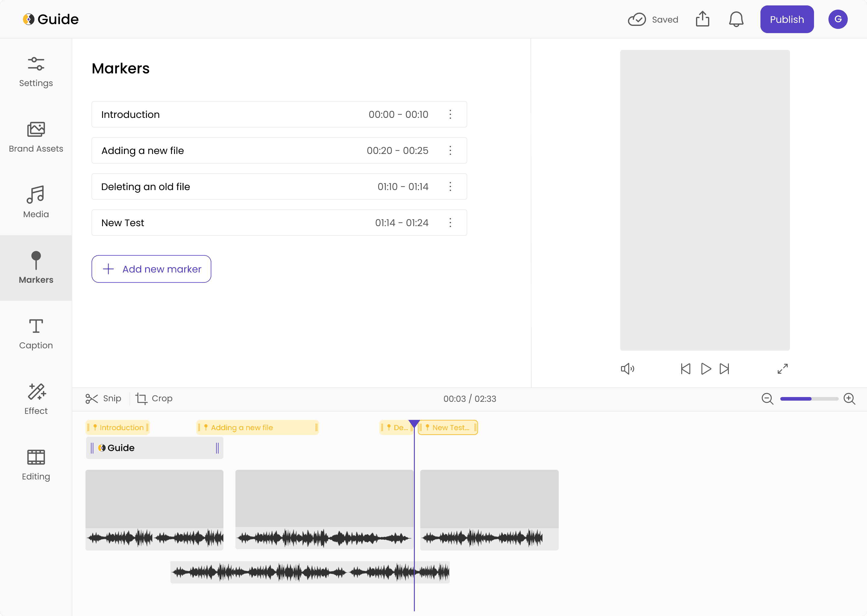
Markers
Markers are like sections or chapters in a video that the user can manually add. All the added markers are in the main panel, with an option to add a new marker and drag it across the timeline to indicate a certain duration
List of markers created along with timestamps
Option to add a new marker
Added markers over the video timeline to indicate split and duration
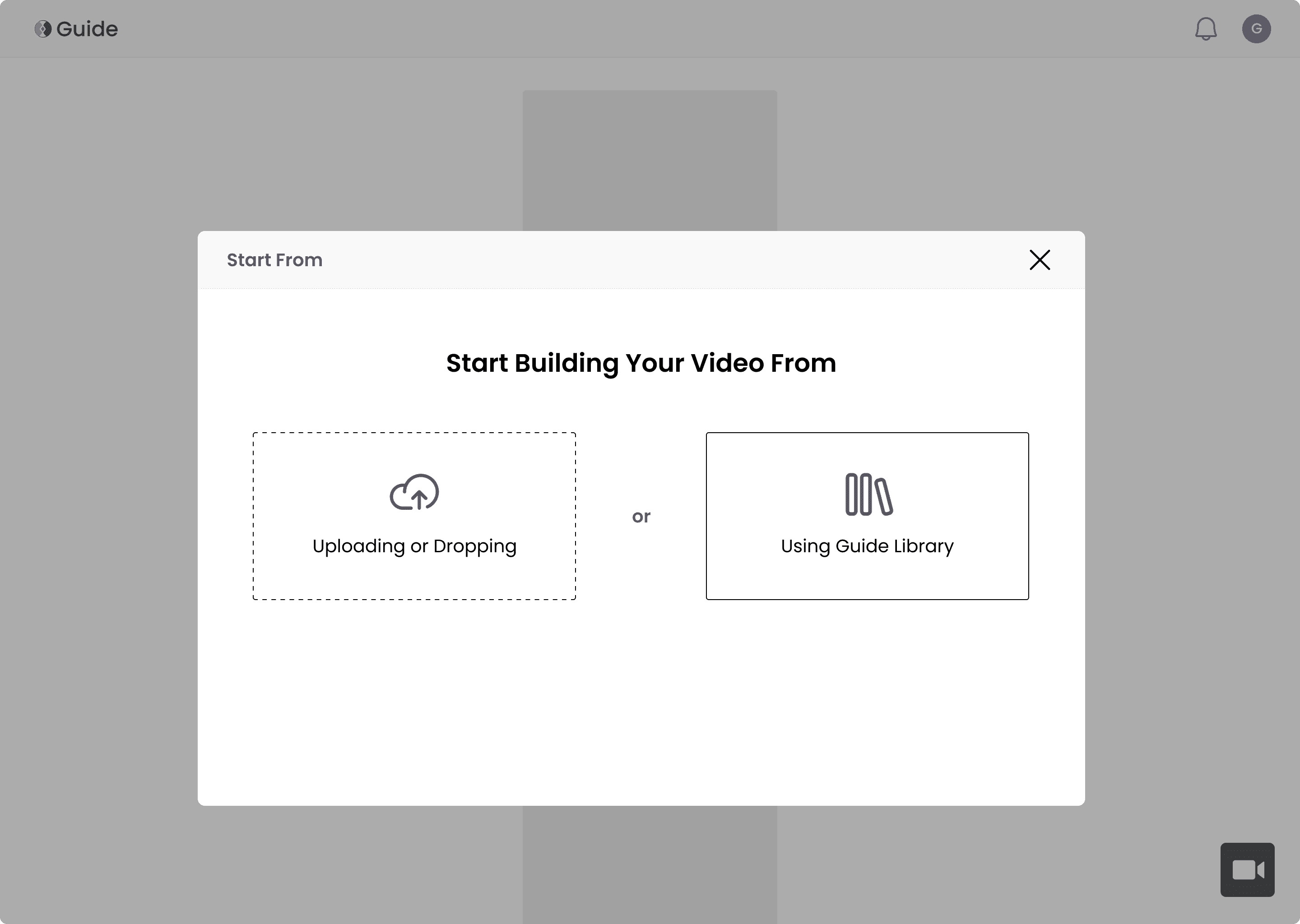
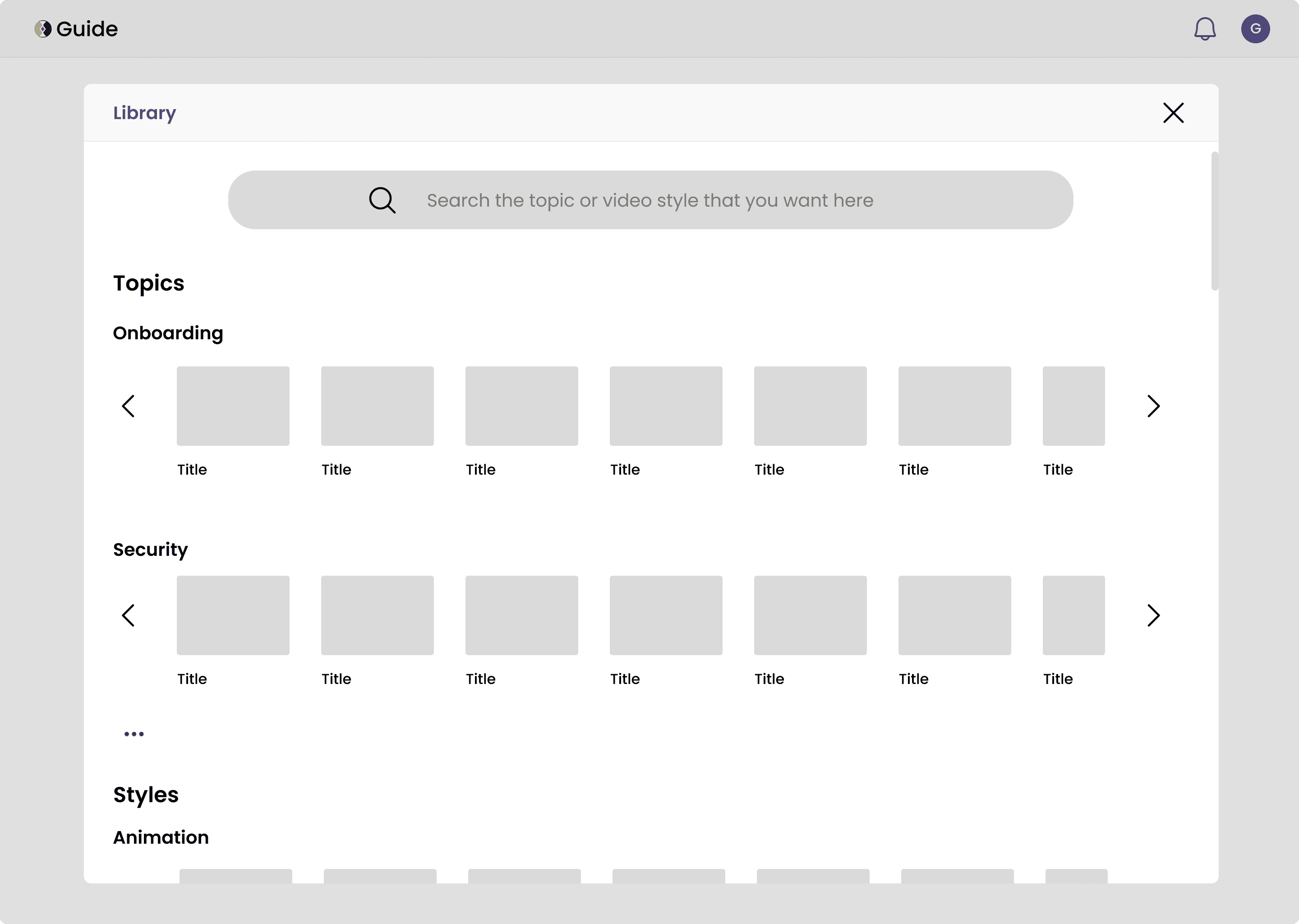
Upload Popup
This popup is accessible to admins and creators from the homepage. Users can either upload multiple files from their computers or use Guide’s existing template gallery to quickly get started
Templates
Users can either search and select ready content organized by topic or pick styles of professionally edited templates where they can insert their content. More information and a CTA to proceed appears on clicking
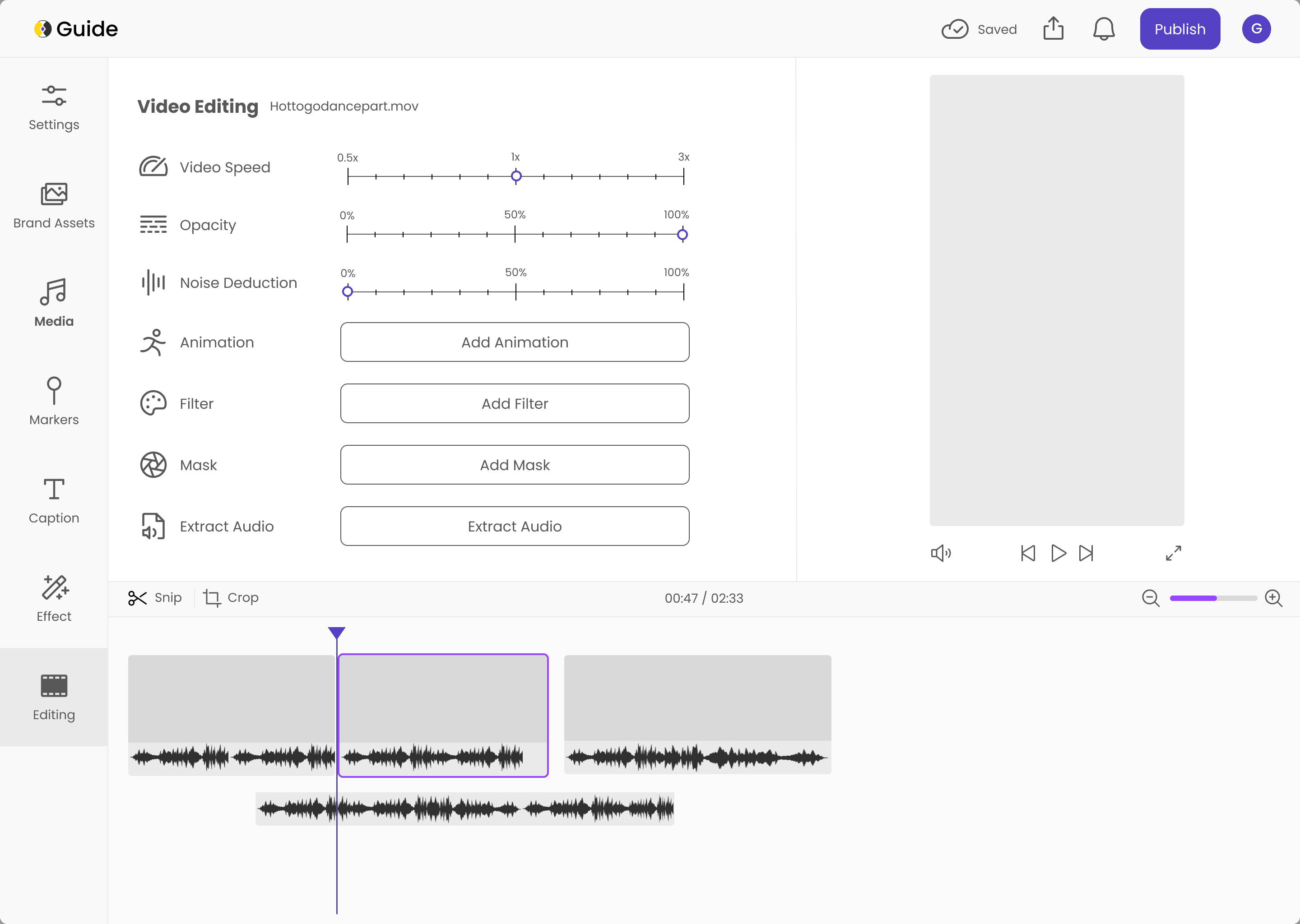
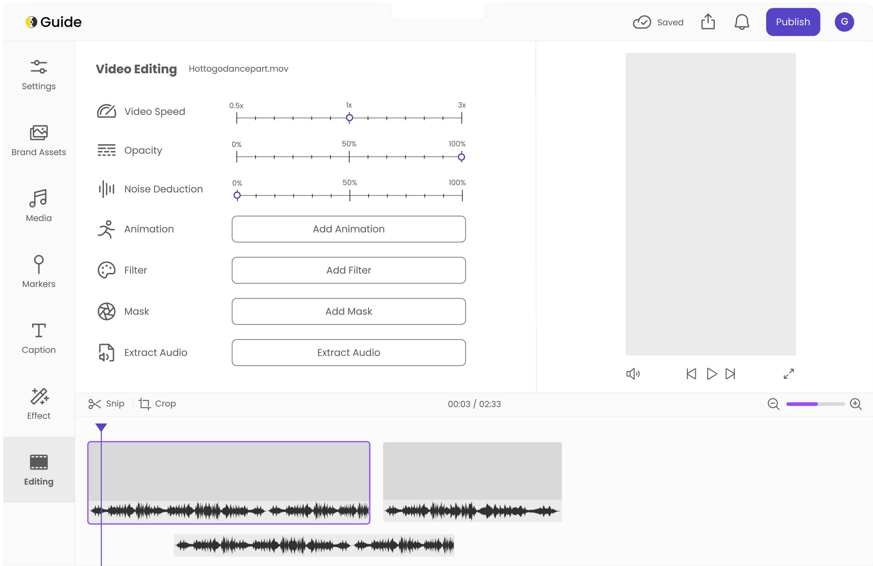
Editing
General editing screen that a user lands on after uploading their files. Uploaded videos are situated in the bottom panel, with an option to trim and reorder videos by dragging.
Quickly start with ready templates and content from Guide
Drag and drop or click to select files from PC
Search to find relevant topic material
Categories of content
A second type of template: Styles where users can find professionally edited videos with placeholders for their own content
Video editing options for video that is selected in the bottom panel
Uploaded videos are displayed here, along with layers for sound and other media
Preview panel for the edited video
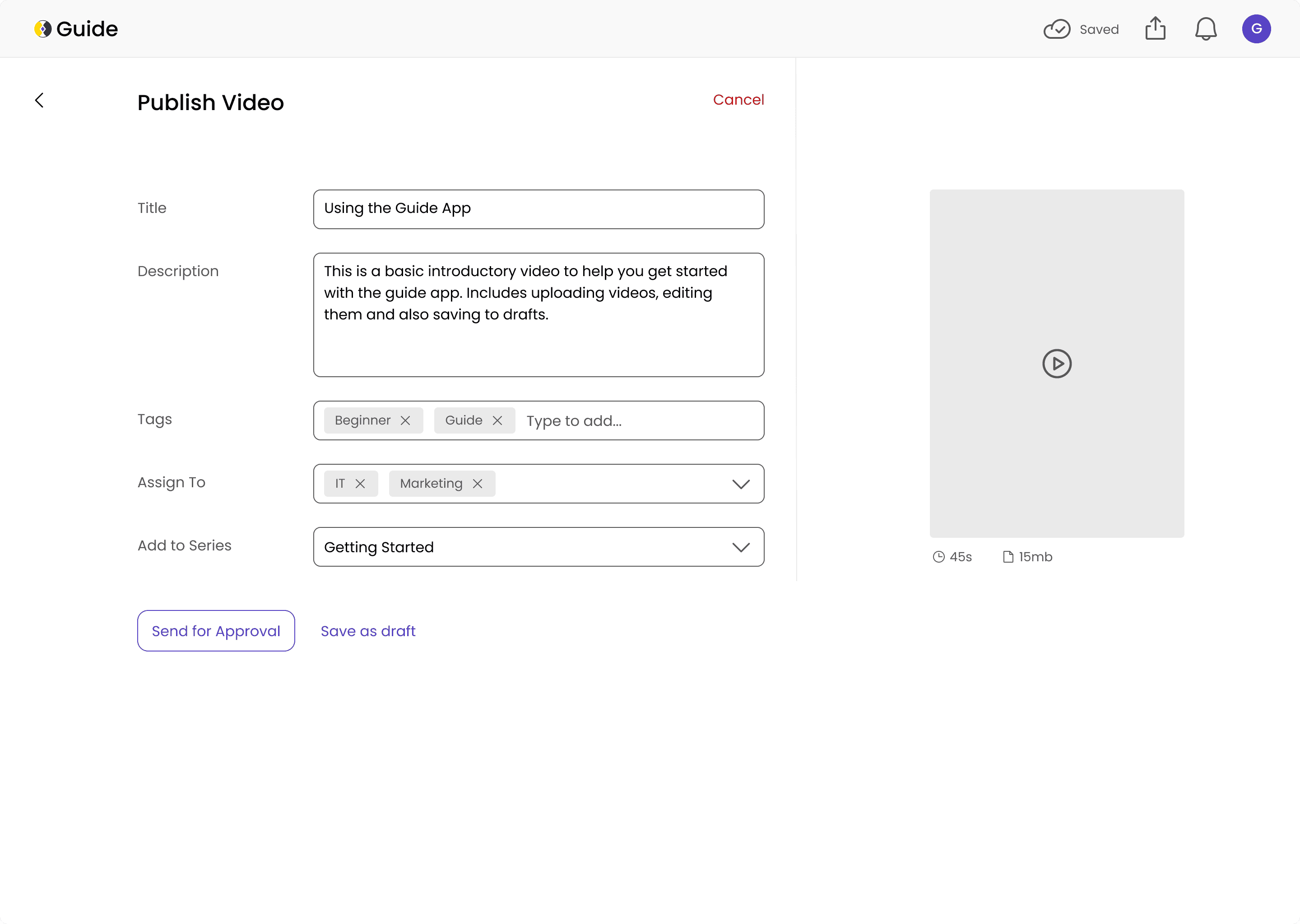

Other Screens
OUR SOLUTION RECOMMENDATIONS
Advanced Video Editing Features
Provide editing capabilities with a special focus on the Mark and Snip function, allowing users to easily select and trim specific portions of videos.
Brand Assets Integration
Allows seamless incorporation of company branding elements, logos, and other visual assets into video content to maintain consistent brand identity.
Complete Video Editing
& Publishing Workflow
Provide editing capabilities with a special focus on the Mark and Snip function, allowing users to easily select and trim specific portions of videos.
Mobile-First Approach
Designed primarily for mobile devices, ensuring users can access and edit content conveniently from their smartphones or tablets.
Content Categorization & Course Creation
Enable systematic organization of video content and facilitate the creation of structured courses, making it easier to manage and deliver educational material.
Ready To Use Video Templates
Provides pre-designed video templates and content that users can quickly customize, saving time and ensuring professional-looking results.

CONTEXT
Guide, a Learning Management Platform (LMS), offers byte-sized learning content tailored for mid-sized remote companies. While its focus on concise content aligns well with modern workplace learning needs, content creation for the platform remains cumbersome.
We aimed to streamline this process by introducing video editing capabilities directly into the platform. HR administrators and content creators can trim, edit, and structure videos into the platform's 90-second chapter-wise format. This reduced dependence on external software and improved overall workflow efficiency.
TIMELINE
Aug 2024 — May 2025 (Capstone Project)
TEAM
Dimple Chandnani (Me) Chien-Chi Liu, Shruti Muralidas, Saie Wable, Shihao Lan, Yu-Chi Mei
ROLE
Research, Design, Prototyping, Management
AFFILIATED WITH
University of Maryland - College of Information and Guide App
PRODUCT DESIGN | RESEARCH
Enhancing a Micro-Learning Platform
with Video Editing Capabilities

PROBLEM DEFINITION
The existing flow to edit content requires external software, leading to inefficiencies and increased time consumption.
Editing is necessary since the app only supports 90 second videos. Additionally, there are very limited ways to manage content when uploading. For example, users cannot upload multiple files, organize into chapters or use templates.
Our goal is to develop an integrated solution that allows users to upload and edit videos directly within the platform, streamlining workflows. We aimed to reduce content creators’ editing time by at least 30%.
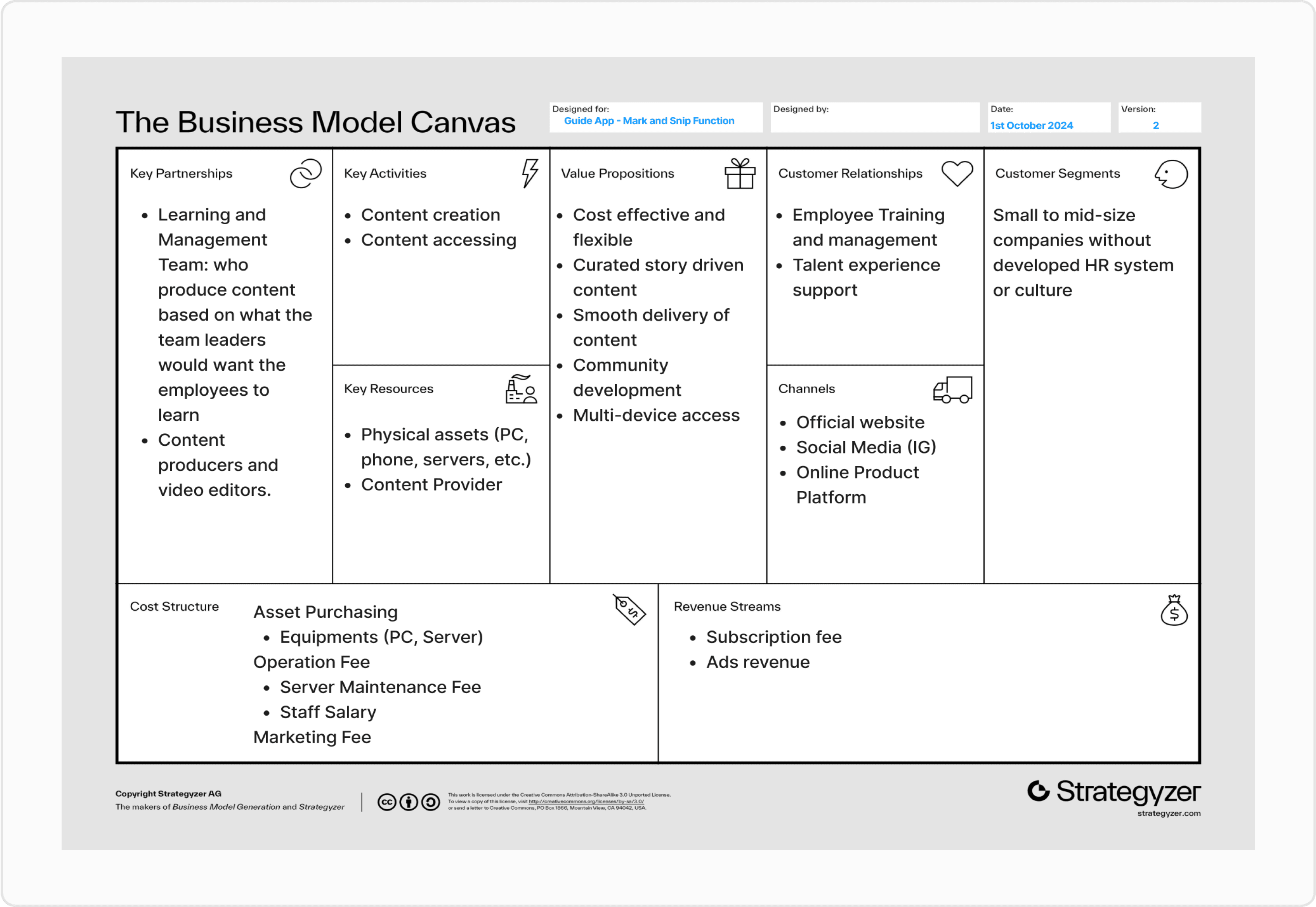
UNDERSTANDING THE BUSINESS
To ensure alignment with organizational goals, we mapped the operating model on a Business Model Canvas.
DATA ANALYSIS
OUR KEY FINDINGS FROM INTERVIEWS AND COMPETITORS
We synthesized interview and competitor analysis data using thematic analysis to extract actionable insights.
We mapped key value propositions against user needs, identified critical success factors for the video editing solution, and analyzed potential technical and operational constraints.
Why?
This approach helped us identify recurring themes and align findings with our design goals.
COMPETITOR ANALYSIS
We conducted a comparative analysis
of 10 competitor LMS and video editing tools by exploring trial versions, attending live demos, and documenting key features, pain points, and value propositions.
Why?
The goal was to identify industry trends, gaps in existing solutions, and best practices we could leverage for Guide’s platform.


USER INTERVIEWS
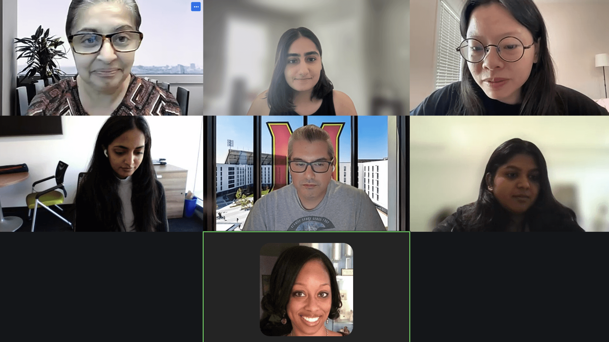
We conducted semi-structured interviews with 8 participants, representing content creators, HR personnel, and employees.
Why?
We chose semi-structured interviews to allow flexibility in probing specific areas based on user responses while maintaining a consistent focus on our goals.
Each interview was about 45 minutes and mainly explored:
Challenges in video editing and content creation workflows.
Tools and features that could enhance efficiency.
Pain points in training and onboarding experiences.
zoom.com

01.
Customization Challenges
Existing mobile tools fall short in providing options like layered text animations, limiting flexibility for content creators.
02.
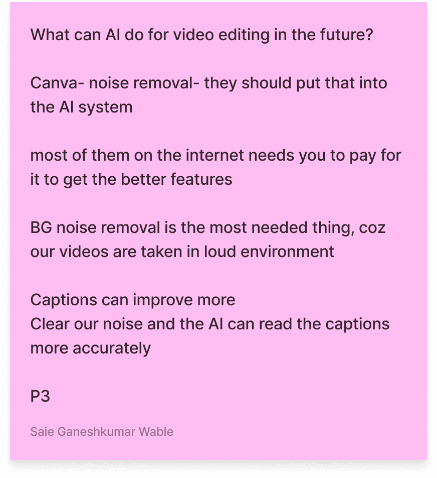
AI Limitations
While AI tools assist with basic editing, they struggle with complex tasks like accurate captioning & nuanced decision-making.
03.
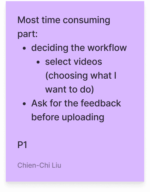
Time-consuming Workflows
Tasks like video trimming, adding music, and applying transitions require significant manual effort on external apps
04.
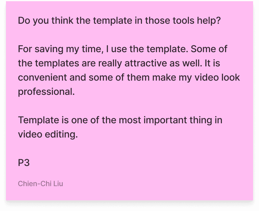
Template Use
AutoCut and template-based editing emerged as valuable features for reducing effort and standardizing output.
No existing users
Since the app was relatively new, we relied on users recruited by us and information from the client.
Development Limitations
The client had a compact developer team, which is why our feature scope was limited.
CONSTRAINTS
RESEARCH PLANNING
To start off, we conducted comprehensive background research to justify the need for an in-platform video editing feature. Our research objectives included:
Understanding the current pain points of Guide’s users and aligning the solution with their needs.
Exploring competitor tools to identify gaps in video editing features.
Testing the feasibility of a “Mark and Snip” feature tailored to Guide’s unique content format.
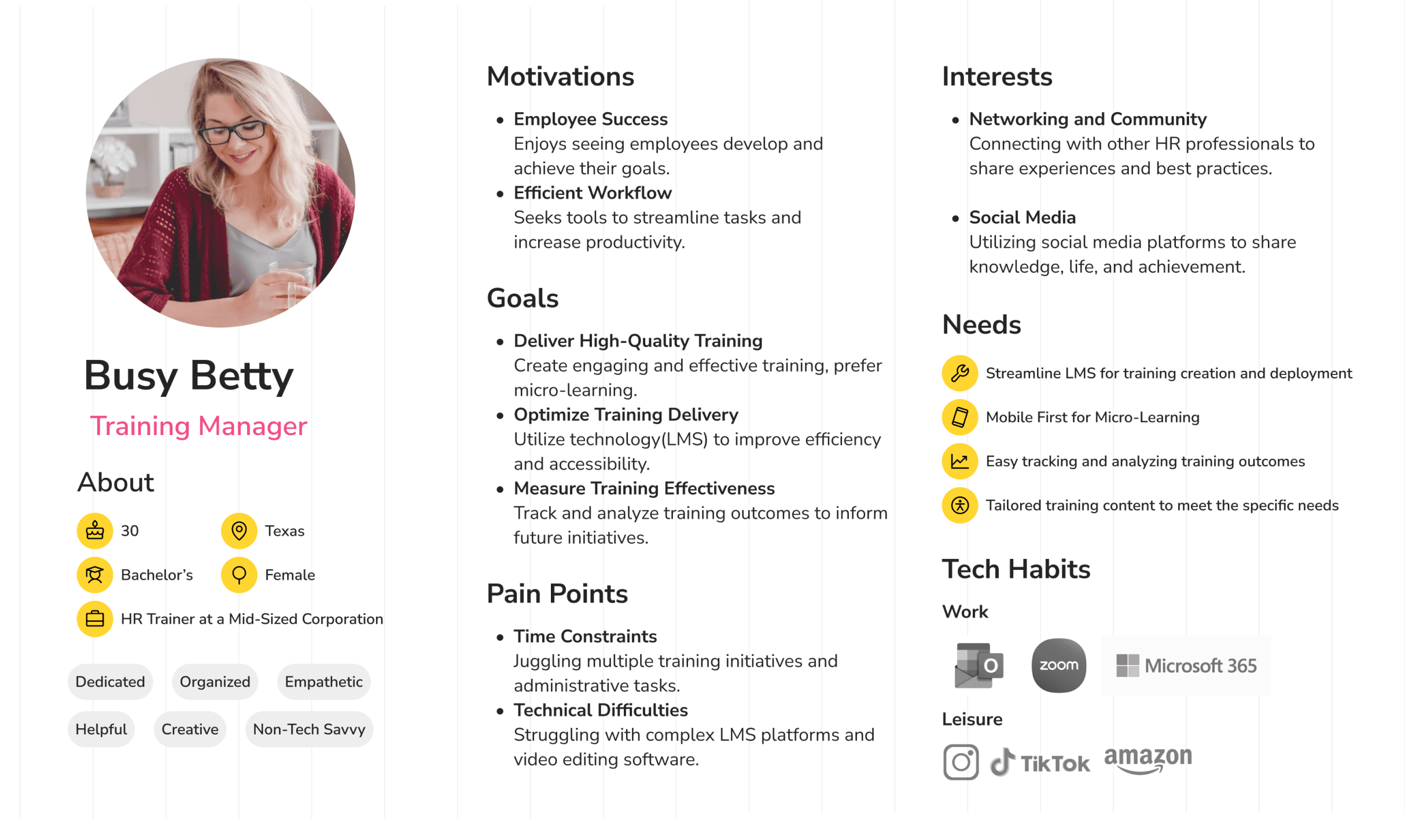
Our Target Users
Content Creators
Responsible for video production and editing.
HR Administrators
Overseeing platform content distribution.
Employees
onsuming the learning content for training.
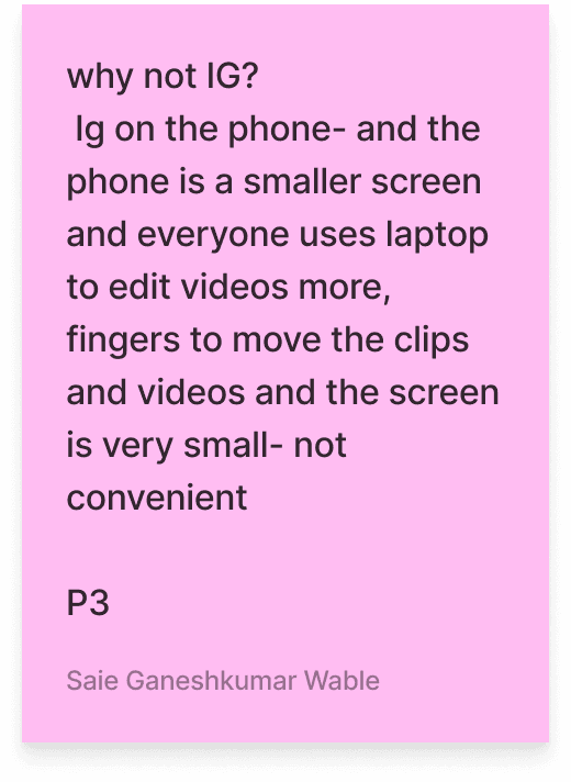
Mobile-First Trends
Competitors prioritize mobile usability to enhance accessibility
Social Features
Many platforms lack features that foster collaboration and community among learners.
AI-Driven Tools
Automated editing and captioning reduce manual workload but require refinement for nuanced tasks.
Video Editing
Advanced features like multi-layer editing, templates, and branding tools are standard
Integration
Seamless integration with workplace tools like Slack and Teams is increasingly common.
REFLECTIONS ON SPRINT 1
CHALLENGES
Our team demonstrated strong planning and seamless internal communication, fostering an effective collaborative environment.
Additionally, we established a solid rapport with the client, which set a positive tone for the project. The in-depth research conducted during this phase proved crucial, enabling us to uncover key market trends and user needs that laid the foundation for our design decisions.
While Sprint 1 had its successes, we encountered several challenges that required adaptability and problem-solving:
Unclear Project Direction: Ambiguity in the client's initial vision made it difficult to align on specific objectives early on, highlighting the importance of upfront clarity in project scoping.
Delayed Access to Resources: Limited access to the trial version of the product hindered progress and emphasized the need for contingency planning in resource-dependent tasks.
Participant Recruitment Constraints: A restricted timeframe and network for scheduling interviews, coupled with the lack of direct user access from the client, required additional effort and creative outreach to recruit participants.
Compressed Timeline: The client’s eagerness to transition to the design phase ahead of schedule posed challenges in fully exploring the research phase, underscoring the need to balance client expectations with project deliverables.
USER TESTING
We tested our prototype on Useberry with 4 participants
“It's kind of easy at the later steps after getting familiar with your editor.”
“I think your structure & interface looks very nice at this stage, very intuitive”
“The overall flow from upload to edit to publish was simple to follow”
They mostly liked it
Why Useberry?
Easy to understand interface for participants, comprehensive data for analysis (time, heat map)
KEY IMPROVEMENTS
Meaningful Navigation Order
Most users wanted to keep current navigation design, but change the sequence of the features to reflect frequently used features.
Clearer Terminology
It is confusing to understand what a “marker” is. Users also weren’t sure about publishing and approval language.
Better Visual Cues
Users mentioned they had trouble noticing certain layers in the timeline. Visual cues like naming and colors in the timeline would help.
Intuitive Icons
The current create button on the home screen resembles a Zoom video call icon, could be changed to something more related to uploading and editing
Coach Marks
Users would benefit from onboarding coach marks to explain the app’s layout and where key features are located
And made some suggestions